Rate The Banner/Signature
| evanASF27 |
12-01-2004 06:40 PM |
Well this is the pic I used for the award...couldn't really have made it better with what I got.

*edit*
Whoops forgot to rate your sig Umino! ^^;;
...hmm...a very interesting pic O.o ...hmmmm...nice quality, overall nice...8.5/10

On another note...I redid the font in my old PCF banner...what do you guys think?
| Darkside |
12-01-2004 07:33 PM |
evan: #1 8/10- alittle plain and grainy
#2 9/10 - a classic
| Tickle Tickle |
12-02-2004 04:05 PM |
(Attached sig): It looks a bit odd, I can't really put my finger on it. 7/10
| Asirt |
12-02-2004 06:06 PM |
Super Umino,
Quality of image is very good. The pan is well done, and the clarity is pretty good as well. The pink font, although hard to read at times, goes well with the image. Overall, I can't see any other problems with it, so I give it a 9/10
Darkside,
Quality of both images are good. I like the animation, even though it's very small, but that's from the size limitation, so that doesn't drop you down. Clarity is pretty good, but the animation one has very little grain in the image. Overall, it's pretty good. I give it a 8.5/10
Quality of attached image is good. It looks a bit too sharp, and there is some grainy artifacts on some of the objects. The image overall is good, but clarity could use some work. I give it a 8/10
evanASF27,
Since I already rated your current sigs in the past, I'll rate your attached banner. Quality of image is good. The font fits pretty well with the two Bigs. Clarity is pretty good, and I do not notice any grainy artifacts at all. Overall, it's very nice. I give it a 9/10
Yet another new banner for today. Kasumi Tomine from Alien 9.

Later,
Trisa
| Christina Perry |
12-03-2004 07:42 PM |
Trisa: The eye is so awsome and that anime charater is so cute.
The Eye: 10/10
Image: 9.9/10
V Rated this banner I made:

| Tickle Tickle |
12-03-2004 08:10 PM |
| quote: |
Originally posted by RogersGirl
|
That's a really cool sig, RogersGirl. The image is clear, and pretty original. 8/10
| Ace of Spades |
12-03-2004 11:26 PM |
Super Umino: Great job bringing hot anime chicks together in one pic 8.5/10
| evanASF27 |
12-03-2004 11:52 PM |
Ace of Spades - Appropriate for the season

9/10!!

Now then...would the next couple of people PLEASE rate the following banners and not the one currently in my sig????
Rate this...
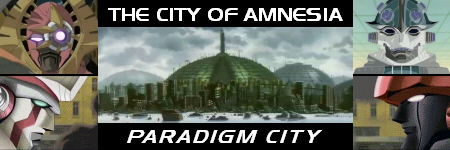
and rate the attached version *below*. I want to see which is 'better', cos I'm thinkin about changin my sig pic.
| Tickle Tickle |
12-04-2004 09:33 PM |
| quote: |
Originally posted by Ace of Spades
Super Umino: Great job bringing hot anime chicks together in one pic 8.5/10 |
It's all one girl, Cutie Honey. ^^
Evan-
Both sigs posted seem fine. 8/10
Current sig is really nice for the holiday season! 9/10
| evanASF27 |
12-05-2004 02:46 AM |
| quote: |
Originally posted by Super Umino
| quote: |
Originally posted by Ace of Spades
Super Umino: Great job bringing hot anime chicks together in one pic 8.5/10 |
It's all one girl, Cutie Honey. ^^
Evan-
Both sigs posted seem fine. 8/10
Current sig is really nice for the holiday season! 9/10 |
Well that don't help me o.o;; I'm trying to see which is better...
(btw I already rated your sig. >.>; )
And btw, the current banner I have in my sig (for SodorIslandForums' 2nd anni.) is actually a screenshot of "
Peter Sam" pulling 2 Skarloey Rly coaches across
Dolgoch Fall on the Talyllyn Rly (in M$ Train Simulator). I am proud to be a Thomas the Tank Engine (Awdry's Legacy) fan.
Could the next person please tell me which "Paradigm City" banner (in my above post) is better??? 
| Almasy |
12-06-2004 12:24 AM |
| quote: |
Originally posted by evanASF27
Could the next person please tell me which "Paradigm City" banner (in my above post) is better???
|
Evan: Out of your two PCF banners, I prefer the one where Big Venus' helmut is pink-ish (as opposed to the other one, in which it's green-ish). ^_^
| The Fallen Phoenix |
12-06-2004 08:21 PM |
Very, very impressive. This is certainly one of your better banners by far. First, I like the font used for the text; personally, I like the color, too. Another big plus is that it covers the length of the banner...that might not seem too important, but it makes the overall signature look a lot better, I think.
The banner itself...one of your better editing jobs, and that's saying a lot. I love how your Santa hat blends into the clouds; I think that was a nice touch. Saturation is very good, too. I think the background could be a little sharper, but that's really the only "problem" I can see with the banner...even as it is, it's probably one of the better ones (in terms of technical skills and overall appearance).
Overall, I have to give the signature no less than a 10/10. It's that damn impressive, really...
| Madrona |
12-07-2004 12:38 PM |
Lets see..going aback a bit
Evan, I agree with Almasy about which of the banners is better. The one with Big Venus being pink is better not only becasue that stands out more, but because the domes don't seem quite as dark. 8.5/10 for both.
And of course, your current banner is awesome! 10/10
Almasy, it's beautiful. I too like the way the hat blends into the clouds. Your picture is very clear and nothing seems out of place. Basically, everything that FP said
10/10
FP, it's very colorful. I could wish that the text of your name was a bit bolder to help it stand out against the roughness of the image ( which I don't mind, btw). I like the way your avatar and Sig pair up. The quotes are great 9/10
Mine is just for the holidays...from the book "The Polar Express"
Madrona
| Tickle Tickle |
12-07-2004 03:56 PM |
I like it Madrona, very fitting for the Holiday season! 9/10
| Big Money |
12-09-2004 08:00 PM |
Umino: Although I'm not familiar with the show, it's a great image! Very colorful, and I'm a big fan of the retro spirally bands of color...
9/10
As for my signature... I drewed it mehself...
| The Big Finale |
12-09-2004 08:18 PM |
Big Money-- I love that. So, the guy in the sunglasses is b-money... and the megadeus is obviously Big Money... So which of those are which of your other MFL Domini?
All in all, very nice. Very rare to see a self-created font signature, pardon me.
For the style alone, I give it 9/10.
Big Money, your sig is crapping sweet. It looks like some kind of awesome graffiti mural. And it has a huge robot. 10/10.
| evanASF27 |
12-10-2004 02:31 AM |
BIG MONEY!!! 10/10 That sig is friggin awesome!! @_@ (makes me wish I could draw a megadeus in a fighting stance

)...
((well, makes me wish I could draw megadeuses PERIOD. I got lucky with Big Zenigata))
| Gummibear |
12-10-2004 06:42 AM |
Big Money: 10/10 for pure creativity. Your banner is truly unique! Great coloring and artwork!
| BethMcBeth |
12-10-2004 08:00 AM |
Oh yaya! GummiBear289!! I really like yours! Its a normal picture of all of the 5 main Sailor Scouts! And Reni too! And its even festive for X-mas too! Sweet! 10/10 ^_^""


