Rate The Banner/Signature
| Nine Kuze |
09-25-2006 10:31 AM |
I don't know what the hell you're going for really. The Nutty Professor and Hellsing, huh? ...Interesting combination. I like the expressions on Anderson and Victoria's faces and quite clever editing Anderson's quote to what it presently is. But I think its kind of overkill with the "The Hell?" statement personally.
Sara Comatori: 6/10
Peace.
| 088nd |
09-25-2006 02:30 PM |
BOOO Stoudemire! I hate the Suns

Looks nice though, good pic
9/10.
| Nazrael |
09-25-2006 04:57 PM |
Nice.
9.5/10
| Valdoom |
09-26-2006 03:33 PM |
I give it a 8/10 for creativity and cleverness.
| Nine Kuze |
09-27-2006 12:27 PM |
The picture is a little too square but its not too bad of a fit I suppose. Its too dark and the mecha that's being displayed there is rather too dark to see as well but you can make it out all the same. And I'm not really feeling the quote.
Valdoom: 5.9/10
Peace.
| David Ryder |
09-30-2006 01:30 PM |
Nine: Not a B-ball fan, but it is a well made sig. 9/10
| Sara Comatori |
10-12-2006 01:41 AM |
Like, Makes sense unlike the world today. 9/10
| FlashBoy |
10-17-2006 12:20 PM |
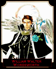
Yay, Wil. I knew you would have him. You won't shut up about Wil. That comes form the Manga... 10/10
| Sara Comatori |
10-18-2006 04:31 PM |
HOW DID YOU GET THOSE PICTURES!?!?! I haven't even finished Public Samurai...he's not red. 7/10
| The Baker St. Irregular |
10-28-2006 12:14 PM |
Nine XXVI: Effective use of negative space! It really works. I think the color needs more contrast so it will look different from the avatar. 8/10.
Sara Comatori: Hmm... Something about the picture bothered me so much that I was totally compelled to drag it into Photoshop and tinker with it. Blame my digital artist tendencies.

Since I can't quite describe what I did, here's the actual product:
If you like it better, feel free to yoink it. Anyway, my only
real problem is that the text is too red. But other than that, it's nifty! 8.5/10.
FlashBoy: The red border = Oww.

The rest = Whee!

8/10
---
Yeah. So after a billion years, I've finally been formally introduced to the world of
(doot-doot-doot-DOOOOO) Zelda. Those are some totally awesome games. And what with the Wii coming out soon(!), I am really looking forward to Twilight Princess. I can't wait to swing that Nunchuk and remote around!

| Nine Kuze |
10-29-2006 03:52 PM |
Helo thur, Mistress. Um, although I miss the eyes from your last sig, the quality of this new one is quite good. The texture upon the sig in quite good as well and I'm feeling the realism of the whole thing too. The text is a little too hard to read but it is a nice touch nonetheless.
Mistress-Samwise: 9/10
It's another basketball player, Tracy McGrady and the season is here in a couple of days. Rockets GO GO GO!
Peace.
| 088nd |
10-29-2006 04:34 PM |
T-Mac in that picture looks confused. CONFUSED BECAUSE THE MAVS ARE BEATING HIM.
Just kidding. Though, hopefully he can stay healthy and get the Rockets to the playoffs, even if I don't like them.
Selvin Young of Texas football.
| Nine Kuze |
10-29-2006 04:38 PM |
CURSE U, DALLAS! Also, when doesn't TMac look confused. Lol, lazy eye.
Also, through your Rocket-bashin' (why do you hate everyone I like?

) you forgot to give me an actual rating.
Anyway, a every clear and quality picture giving center focus to the player and I like how the background is pixaled and reflects off the player, giving him all the attention.
088nd 8.5/10
Peace.
| 088nd |
10-29-2006 05:15 PM |
Oops, I did, didn't I?
9/10.
It isn't that I hate all the teams you like (well, maybe it is by coincidence), but the Dallas-Houston rivalry is pretty big in sports. Just because Houston likes to think they're better than us
| Sara Comatori |
11-03-2006 12:13 PM |
| Nazrael |
11-15-2006 02:31 PM |
8/10
I made a new one. ^_^
| Green_Bird |
11-20-2006 01:27 AM |
Nazrael: 7/10...the borders don't match...but otherwise, okay...
New banner to go with the Kururu theme...
| Nine Kuze |
11-20-2006 04:04 AM |
Um, I like the new thing you got going on quality in your sigs. Kind of like looking at a television.
I don't really know what I am looking at, but I do like the square lights around, I like the border and your name in the corner as well.
Green_Bird: 7.9/10 (also, you're not a ghost anymore!)
Peace.
| Green_Bird |
11-20-2006 04:24 AM |
Blame the image quality on youtube....I had to hide all the interlacing, misplaced pixels and what not with a bunch of image effects. PSP8 is not the best at hiding those things normally. For the record,
here's the original cap. As you can see it was fuzzy to begin with...so it couldn't be helped.
What's the use of being a ghost anymore if there's very few members on here now...
As for yours 8.5/10!
| Nine Kuze |
11-20-2006 04:37 AM |
| quote: |
Originally posted by Green_Bird
Blame the image quality on youtube....I had to hide all the interlacing, misplaced pixels and what not with a bunch of image effects. |
Oh, don't get me wrong G_B. I like the quality of the sig. It's interesting and gives a cool visually quality to it.
Next person, please rate Green_Bird's sig. Kthanxbye.
Peace.